Since the data from the year 1900 lacks both grade and score information, we exclude these records. We will focus on the following eight columns, which contain all the relevant data for our analysis.
Code
library(tidyverse)library(ggrepel)restaurant<-read_csv("~/Desktop/Columbia/EDAV/EDAV Final Project/DOHMH_New_York_City_Restaurant_Inspection_Results_20241210.csv")restaurant <- restaurant |>mutate(`INSPECTION DATE`=as.Date(`INSPECTION DATE`, format ="%m/%d/%Y")) |>filter(format(`INSPECTION DATE`, "%Y") !="1900")
3.1 Grade Distribution
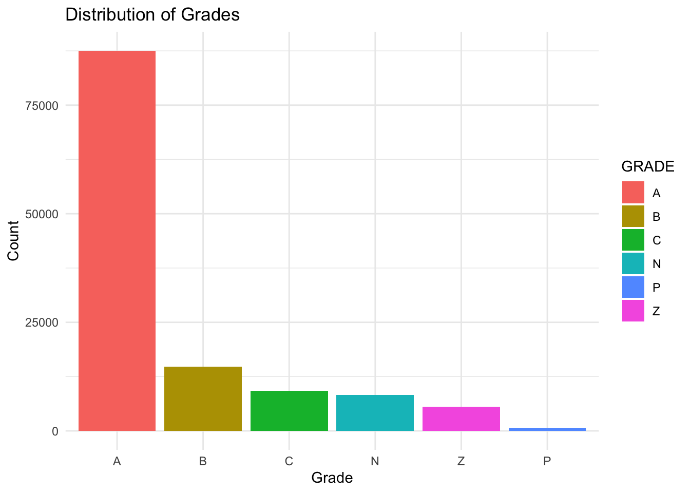
Let’s first take a look at how the restaurants are doing in terms of grade from inspection.
• N= Not Yet Graded • A = Grade A • B = Grade B • C = Grade C • Z = Grade Pending • P = Grade Pending issued on re-opening following an initial inspection that resulted in a closure
We can see that most of the restaurants are Grade A, which is good to know because otherwise the residents in NYC would not feel safe eating outside. Let’s then take a look at how the grade distribution is like for each borough.
Code
#ggplot(percent_data, aes(x = BORO, y = percentage, fill = GRADE)) +# geom_bar(stat = "identity") +#labs(# title = "Percentage of Grades across Boroughs",#x = "Boroughs",#y = "Percentage"# ) +# theme_minimal() +#scale_y_continuous(labels = scales::percent)
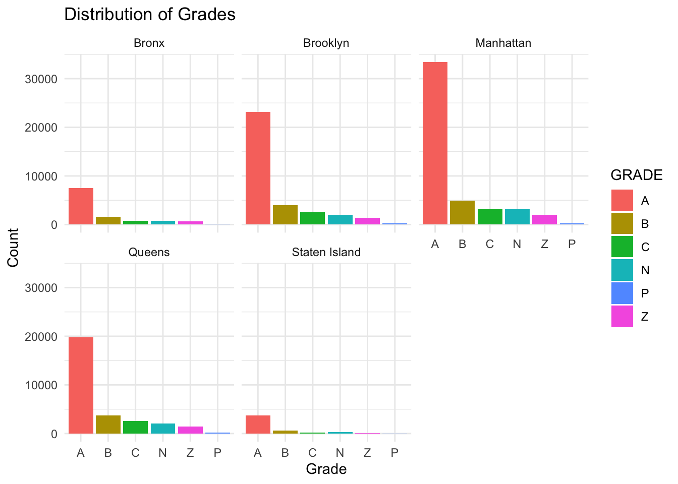
We can see that Manhattan, with the highest number of Grade A restaurants, is very diligent with keeping the hygiene level, at least in terms of food. Although it also has more Grade B’s and C’s, but the total number of restaurants from Manhattan is also the highest so we need to take this into account and study the percentage of the grade distribution for each borough.
Code
percent_data <- restaurant_clean %>%count(BORO, GRADE) %>%group_by(BORO) %>%mutate(percentage = n /sum(n) *100)percent_data |>ggplot(aes(x = BORO, y = n, fill= GRADE)) +geom_bar(stat ="identity") +geom_text(aes(label =paste0(round(percentage, 1), "%")), position =position_stack(vjust =0.5), size =3) +labs(title ="Distribution of restaurants across boroughs",x ="Boroughs",y ="Count" ) +theme_minimal()
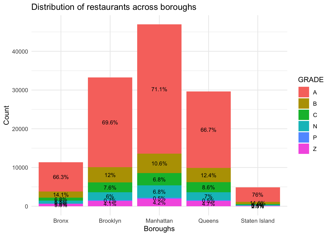
Indeed, Manhattan as the busiest borough rank the top in terms of number restaurants, and Brooklyn and Queens come next. Surprisingly, with the lowest number of restaurants, Staten Island actually has the highest percentage of Grade A restaurants. Although the size of the Staten Island borough is almost the same as Brooklyn, but it is way less crowded with better management.
On the other hand, Bronx, also with a smaller number of restaurants, doesn’t do as well according to its relatively low percentage of Grade A restaurants. It also has the highest percentage of Grade B restaurants, implying that the hygiene level of the borough is not as well managed as the other ones.
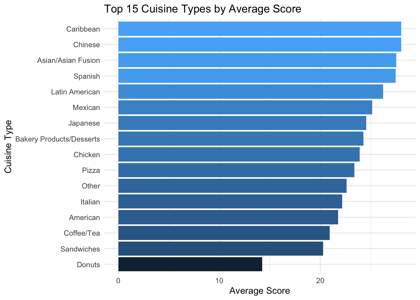
We can see that American, Chinese, and Latin American food are the top three popular cuisine, followed by Mexican, Caribbean, and Japanese cuisines. Then we want to know the average weighted score of these cuisine types.
We observe that Caribbean, Chinese, Spanish, and Asian/Asian Fusion cuisines rank highly. However, despite being one of the most popular types, American cuisine does not receive a particularly good score. On the other hand, Donuts appear at the bottom, which aligns with our expectations, as they tend to be low in nutritional value and may not meet high hygiene standards during processing.
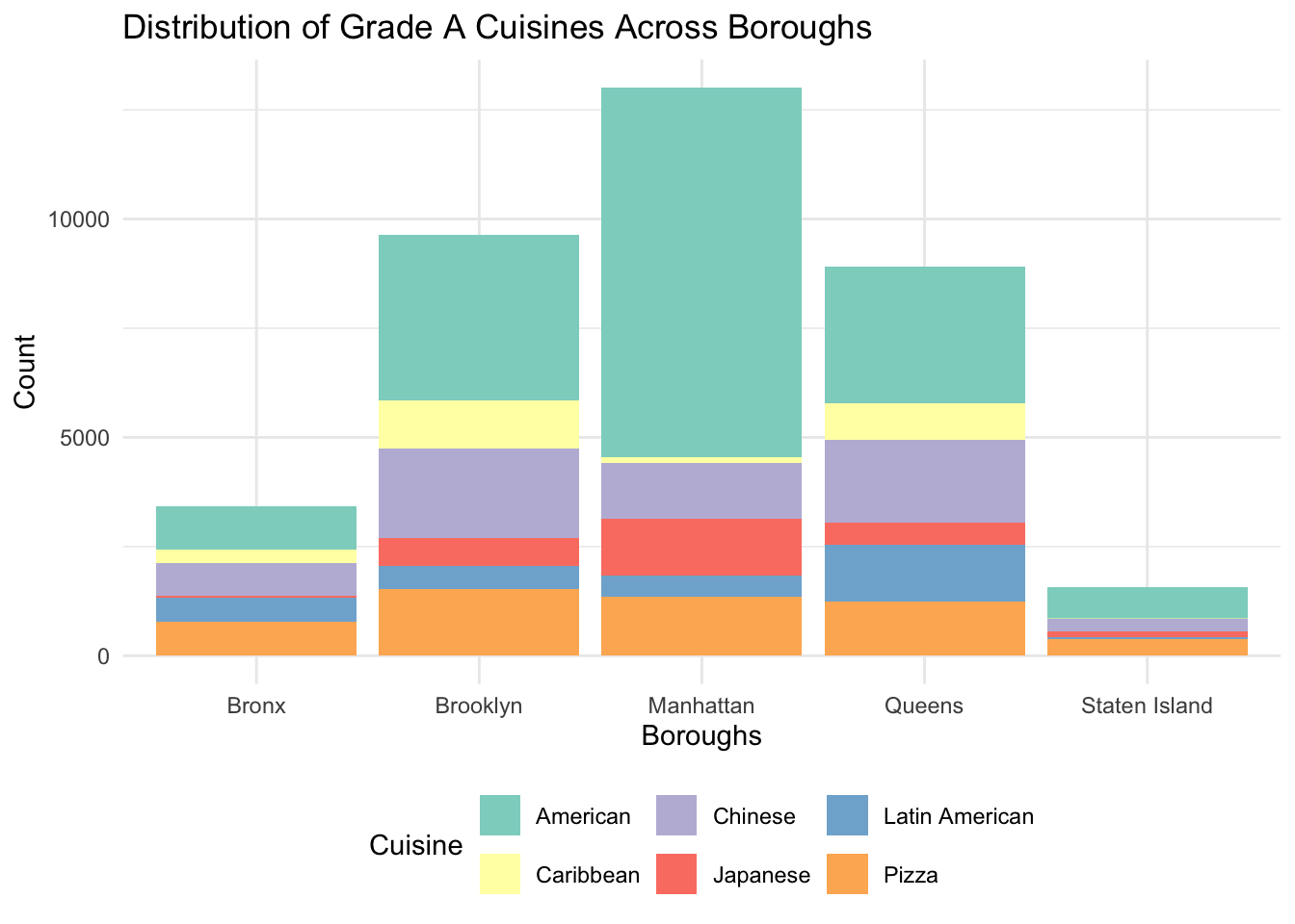
Now let’s see how Grade A cuisines are distributed across boroughs for the top 5 cuisines:
Code
# Count Grade A cuisines by boroughtop_5_cuisines <-c( "American", "Chinese", "Pizza", "Latin American", "Caribbean", "Japanese")cuisine_distribution <- restaurant_clean %>%filter(`CUISINE DESCRIPTION`%in% top_5_cuisines, !is.na(SCORE)) |>filter(GRADE =="A") |>count(BORO, `CUISINE DESCRIPTION`) %>%arrange(desc(n)) # Sort by count# Stacked bar chart of cuisines by boroughggplot(cuisine_distribution, aes(x = BORO, y = n, fill =`CUISINE DESCRIPTION`)) +geom_bar(stat ="identity") +labs(title ="Distribution of Grade A Cuisines Across Boroughs",x ="Boroughs",y ="Count",fill ="Cuisine" ) +theme_minimal() +theme(legend.position ="bottom") +scale_fill_brewer(palette ="Set3")
From this graph we can see that if you want Grade A American or Japanese food, you should definitely go for Manhattan restaurants. But if you are eyeing for Chinese or Caribbean food, you can check out restaurants in Brooklyn or Queens. Latin American cuisine thrives in Queens in particular, which is expected because there are a lot of Latin American people living in Queens. Pizza is just fine wherever you go.
3.3 District Comparison
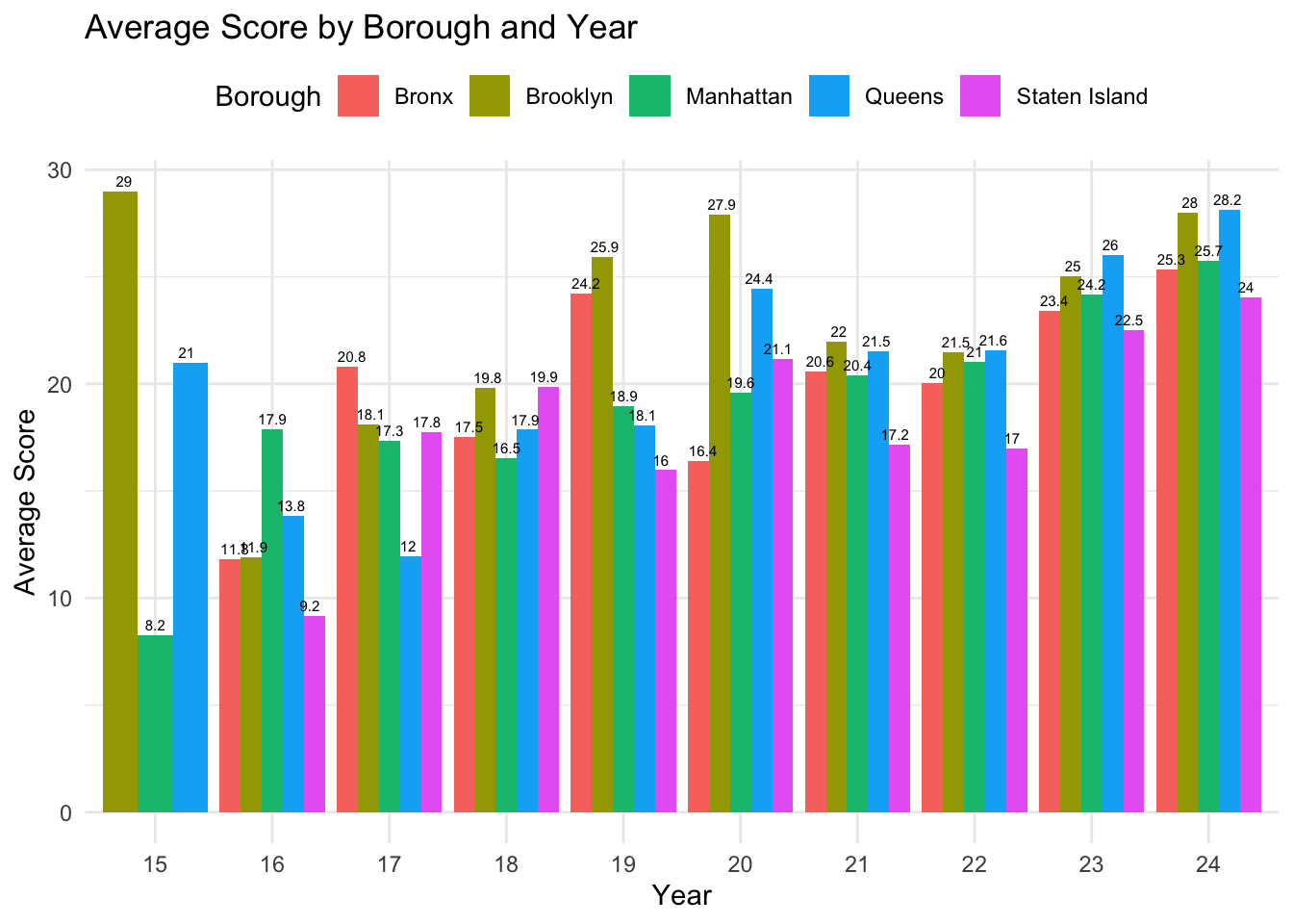
Next, we want to know the inspection result of different district in New York in the past ten years.
Code
library(dplyr)library(ggplot2)library(lubridate)restaurant$`INSPECTION DATE`<-as.Date(restaurant$`INSPECTION DATE`)restaurant <- restaurant |>mutate(year =year(`INSPECTION DATE`))avg_score_by_boro_year <- restaurant |>filter(!is.na(SCORE)) |>group_by(year, BORO) |>summarise(avg_score =mean(SCORE, na.rm =TRUE))ggplot(avg_score_by_boro_year, aes(x =factor(year), y = avg_score, fill = BORO)) +geom_bar(stat ="identity", position ="dodge") +geom_text(aes(label =round(avg_score, 1)), position =position_dodge(width =0.8), vjust =-0.5, size =2) +labs(title ="Average Score by Borough and Year",x ="Year",y ="Average Score",fill ="Borough" ) +theme_minimal() +theme(legend.position ="top")
Code
# Save the processed data as CSV for D3#write_csv(avg_score_by_boro_year, "avg_score_by_boro_year.csv")#library(jsonlite)#toJSON(avg_score_by_boro_year)
Over the past five years, Brooklyn and Queens have consistently ranked as the top two boroughs, while Staten Island has consistently had the lowest scores. Manhattan, positioned in the middle, shows relatively stable performance. A particularly interesting trend is the steady increase in Manhattan’s average score over the past decade. In fact, all boroughs have seen an improvement in their scores over this period.
3.4 Fast Food Chain Analysis Data
Code
fast_food<-read_csv("~/Desktop/Columbia/EDAV/EDAV Final Project/fast_food_chains_foot_traffic.csv")colnames(fast_food)
 [1] "Chain"
 [2] "USLocations"
 [3] "GlobalLocations"
 [4] "2023 U.S. Revenue (Billion USD)"
 [5] "2023 Global Revenue (Billion USD)"
 [6] "Customer Satisfaction (%)"
 [7] "Average Daily Visits per U.S. Store"
 [8] "Total U.S. Visits in June 2024 (Million)"
 [9] "Average Visits per Store in June 2024"
[10] "Change in Visits (June 2024 vs. May 2024) (%)"
[11] "Change in Visits (June 2024 vs. June 2023) (%)"
Code
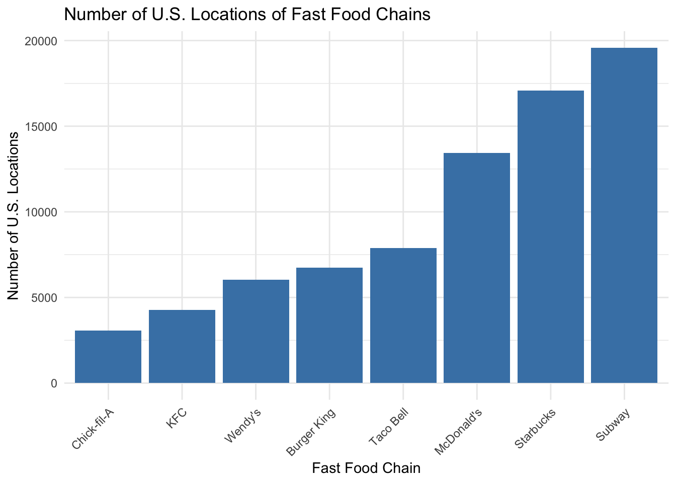
fast_food |>ggplot(aes(x =reorder(Chain, USLocations), y = USLocations)) +geom_bar(stat ="identity", fill ="steelblue") +labs(title ="Number of U.S. Locations of Fast Food Chains",x ="Fast Food Chain",y ="Number of U.S. Locations" ) +theme_minimal() +theme(axis.text.x =element_text(angle =45, hjust =1))
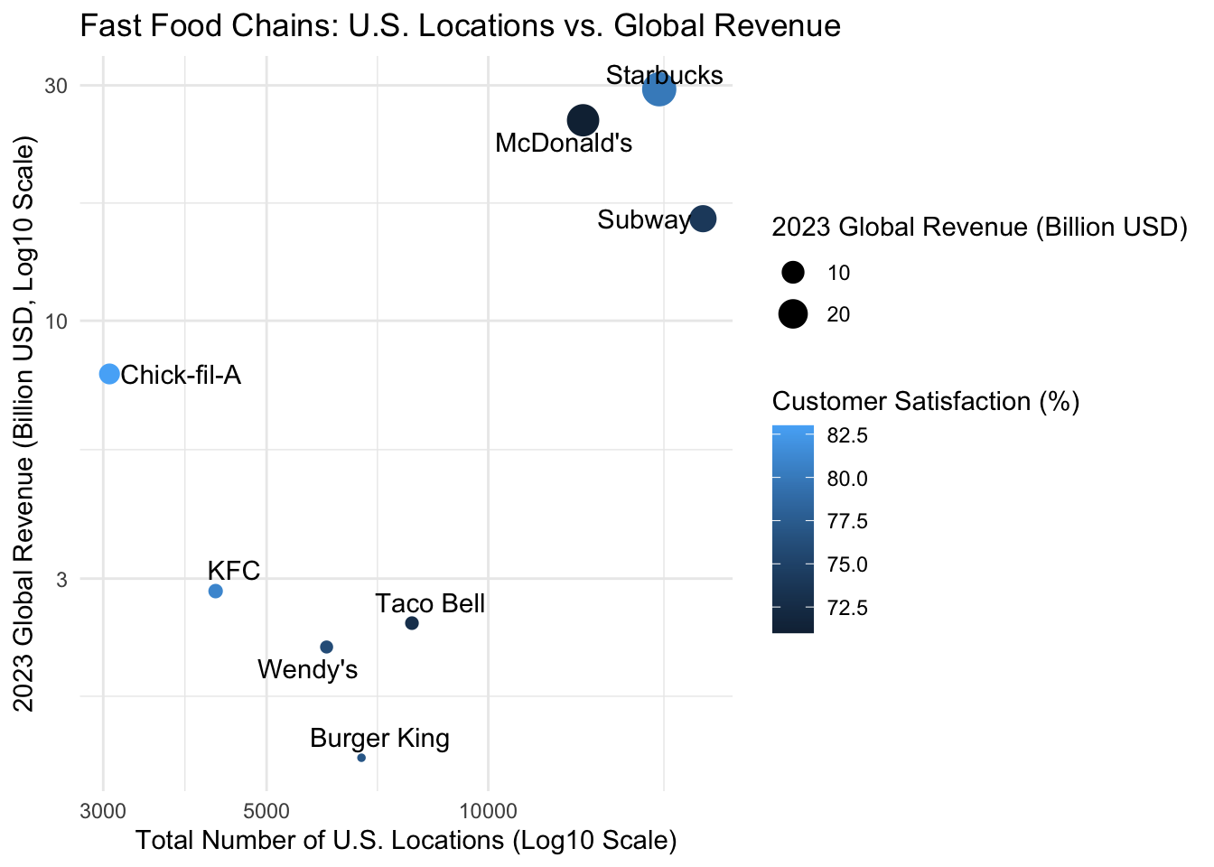
Show the relationship between the number of US locations and global revenue:
Code
fast_food |>ggplot(aes(x = USLocations, y =`2023 Global Revenue (Billion USD)`, label = Chain)) +geom_point(aes(color =`Customer Satisfaction (%)`, size =`2023 Global Revenue (Billion USD)`)) +# Add size and color mappinggeom_text_repel() +# Add labels with text repellingscale_x_log10() +# Log scale for the X-axisscale_y_log10() +# Log scale for the Y-axislabs(title ="Fast Food Chains: U.S. Locations vs. Global Revenue",x ="Total Number of U.S. Locations (Log10 Scale)",y ="2023 Global Revenue (Billion USD, Log10 Scale)",color ="Customer Satisfaction (%)",size ="2023 Global Revenue (Billion USD)" ) +theme_minimal()
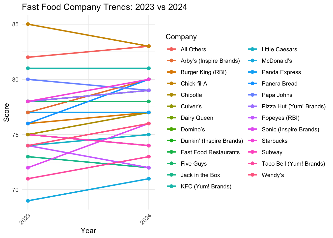
3.5 Customer Satisfaction Data
Code
customer_satisfaction<-read_csv("~/Desktop/Columbia/EDAV/EDAV Final Project/customer_satisfation_2023_2024.csv")colnames(customer_satisfaction)
[1] "Company" "2023" "2024" "% CHANGE"
Code
customer_satisfaction <- customer_satisfaction |>mutate(across(`2023`:`2024`, as.numeric))customer_satisfaction_long <- customer_satisfaction |>pivot_longer(cols =c(`2023`, `2024`), names_to ="Year", values_to ="Score") |>mutate(Year =as.numeric(Year)) # Convert Year to numericcustomer_satisfaction_long |>ggplot(aes(x = Year, y = Score, group = Company, color = Company)) +geom_line(size =1) +geom_point(size =2) +scale_x_continuous(breaks =c(2023, 2024), labels =c("2023", "2024")) +labs(title ="Fast Food Company Trends: 2023 vs 2024",x ="Year",y ="Score",color ="Company" ) +theme_minimal() +theme(legend.position ="right",axis.text.x =element_text(angle =45, hjust =1) )